What a Shapely genome you have!
This might be a case of if you have a really cool hammer, everything looks like a nail, but it was fun mixing tools from different disciplines.
After finding synteny, there's a bunch of paired genes whose neighbors are also pairs. Paired (homologous) genes have similar sequence because they have some function and can't change without loss of function. Non-gene sequence between the paired genes is mostly randomized via mutation, deletion, etc. But, there is non-gene sequence that is conserved between the genes. These CNS's-- conserved non-coding sequences--are usually sites that bind stuff that regulates the expression of a gene.
That looks like this.
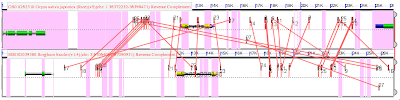
With one gene on the top, and its pair below, both yellow. Pink lines in the foreground connect putative CNSs (similar sequences) between these genes. That the lines cross is bad. CNSs occur right at the level of noise. So even though a similar sequence occurs near both genes, it could be by chance. It is possible to reduce this noise using local synteny. In the figure, that means both ends of the line should be about equi-distant from the end of either yellow gene. And lines that are going diagonally across the image should be removed. The goal is to find the parallel lines and remove those that cross.
Luckily, there's a "bioinformatics" library that lets me write code like this:
That is the simplest case. It also has to remove lines (CNSs) that are in the intron of one gene, and not in the intron of another:

Starting with the top image. The thick blue line in the center of the image is the gene itself. Any large green dots without a black dot over them are what the program called as CNSs. Red CNSs are on the wrong strand and are not considered. CNSs that overlap the grey--either along the x-axis or the y-axis occur in the introns of other genes and are not considered. Green dots covering the blue gene are intronic CNSs. The thin blue line just extends the y=x line. The purple bowtie is what I use to enforce synteny (bowtie.contains(cns) ). Anything outside of the bowtie is either close to the query homeolog and far from the subject, or vice-versa. Real CNSs should fall along the diagonal. And we chose an arbitrary maximum distance from the gene of 12,000 basepairs. It's easy to see the syntenic genes line up along the y=x blue line.
The bottom image filled with lines of the bilious hue is to visualize the crosses (as in the code above). The line with the black stripes has been removed because it overlapped > THRESHOLD lines. After that removal, no other lines crossed and after removing non-syntenic genes outside the bowtie, only 20 CNSs remained.
After all that noise is removed, the original image looks like this in our real viewer:

and those are real CNSs with lovely parallel lines. This runs for thousands of homologous gene pairs and creates a list of CNSs. There are other complexities, i.e. when pairs that are on opposite strands or when there are other syntenic genes in the up/downstream regions.
Other than the extra dimension, MultiLineString() works perfectly for a single gene with many CNSs. The fact that it integrates so well with numpy, and therefore matplotlib is great for visualization. Compare that to making a map file for just a quick look some data. Anyway, a fun project. Cheers Sean and the makers of geos.
After finding synteny, there's a bunch of paired genes whose neighbors are also pairs. Paired (homologous) genes have similar sequence because they have some function and can't change without loss of function. Non-gene sequence between the paired genes is mostly randomized via mutation, deletion, etc. But, there is non-gene sequence that is conserved between the genes. These CNS's-- conserved non-coding sequences--are usually sites that bind stuff that regulates the expression of a gene.
That looks like this.

With one gene on the top, and its pair below, both yellow. Pink lines in the foreground connect putative CNSs (similar sequences) between these genes. That the lines cross is bad. CNSs occur right at the level of noise. So even though a similar sequence occurs near both genes, it could be by chance. It is possible to reduce this noise using local synteny. In the figure, that means both ends of the line should be about equi-distant from the end of either yellow gene. And lines that are going diagonally across the image should be removed. The goal is to find the parallel lines and remove those that cross.
Luckily, there's a "bioinformatics" library that lets me write code like this:
for aline in pink_lines:The .has_crossed is a set() to keep track which and how many lines any given line crosses. Then it's simple to find lines that crossed a lot of others and remove them.
for bline in pink_lines:
if aline == bline: continue
if aline.crosses(bline):
aline.has_crossed.update(b)
bline.has_crossed.update(a)
# sort with most crosses firstThen there will still be some crosses remaining, so the code then loops through pink_lines, find intersections and removes based on the score of the hit, and how many crosses it has.
pink_lines = sorted(pink_lines, cmp=lambda a, b: cmp(len(b.has_crossed), len(a.has_crossed)))
for cline in pink_lines:
if len(cline.has_crossed) > THRESHOLD:
cline.remove = True
for dline in cline.has_crossed:
# remove cline from all lines it crossed
dline.has_crossed.difference_update(cline)
pinklines = [pl for pl in pinklines if not pl.remove]
That is the simplest case. It also has to remove lines (CNSs) that are in the intron of one gene, and not in the intron of another:
There's also the cases where the lines of the CNSs don't cross, but the actual CNS's touch. So on one homeolog there might be a CNS from basepairs 920 to 936 and another from 922 to 937. We also want to get rid of those. So that'd be:
if acns.within(agene) and bcns.within(bgene):
 do_something_with_intronic_cns(acns, bcns)
elif acns.within(agene) != bcns.within(bgene):
 # bad! in only 1 intron
 remove(acns, bcns)
if cnsa.overlaps(cnsb):Finally, the CNSs themselves have to be syntenic relative to the gene--that is, if a CNS cns_a is 9000 basepairs upstream from gene a, and its homeolog, cns_b is 12 basepairs upstream from gene b, that's likely not a syntenic pair. As with synteny dot plots, sometimes it's good to flip the subject homeolog to the y-axis (in the images above the subject is the bottom gene) and keep the query (the top gene in the images above) along the x-axis. Then any hit between the x and the y gene can be drawn in the x-y space. For the genes above, that looks like this:
remove_either(cnsa, cnsb)

Starting with the top image. The thick blue line in the center of the image is the gene itself. Any large green dots without a black dot over them are what the program called as CNSs. Red CNSs are on the wrong strand and are not considered. CNSs that overlap the grey--either along the x-axis or the y-axis occur in the introns of other genes and are not considered. Green dots covering the blue gene are intronic CNSs. The thin blue line just extends the y=x line. The purple bowtie is what I use to enforce synteny (bowtie.contains(cns) ). Anything outside of the bowtie is either close to the query homeolog and far from the subject, or vice-versa. Real CNSs should fall along the diagonal. And we chose an arbitrary maximum distance from the gene of 12,000 basepairs. It's easy to see the syntenic genes line up along the y=x blue line.
The bottom image filled with lines of the bilious hue is to visualize the crosses (as in the code above). The line with the black stripes has been removed because it overlapped > THRESHOLD lines. After that removal, no other lines crossed and after removing non-syntenic genes outside the bowtie, only 20 CNSs remained.
After all that noise is removed, the original image looks like this in our real viewer:

and those are real CNSs with lovely parallel lines. This runs for thousands of homologous gene pairs and creates a list of CNSs. There are other complexities, i.e. when pairs that are on opposite strands or when there are other syntenic genes in the up/downstream regions.
Other than the extra dimension, MultiLineString() works perfectly for a single gene with many CNSs. The fact that it integrates so well with numpy, and therefore matplotlib is great for visualization. Compare that to making a map file for just a quick look some data. Anyway, a fun project. Cheers Sean and the makers of geos.
Comments